Bilge Insaat
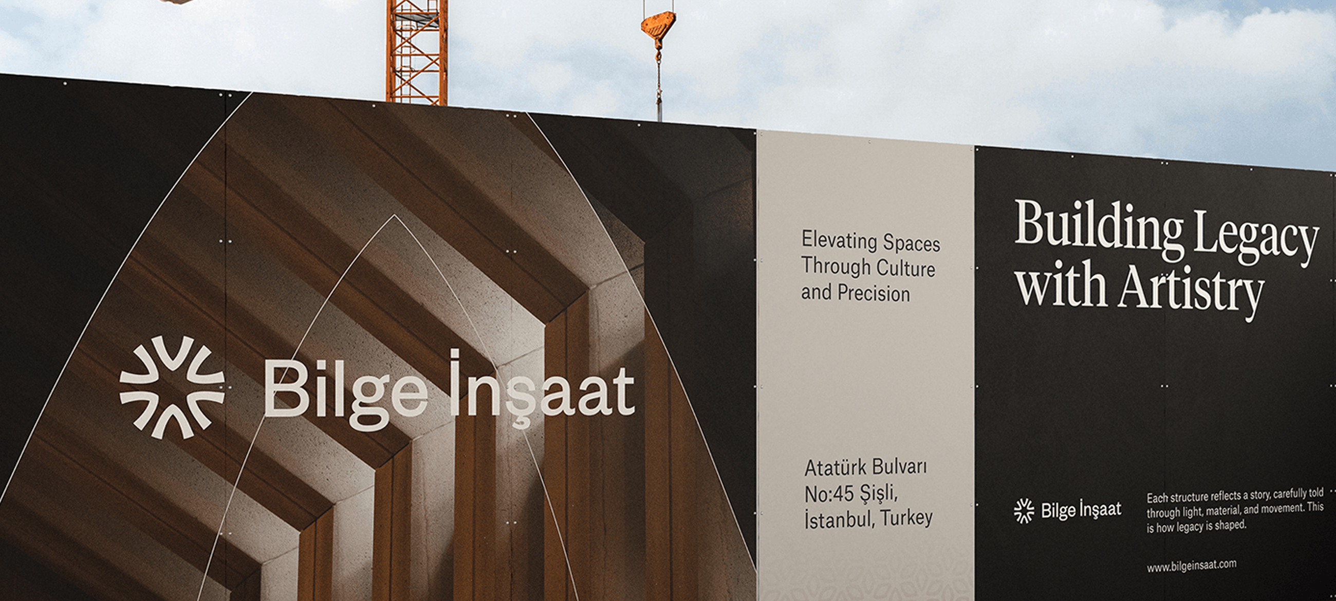
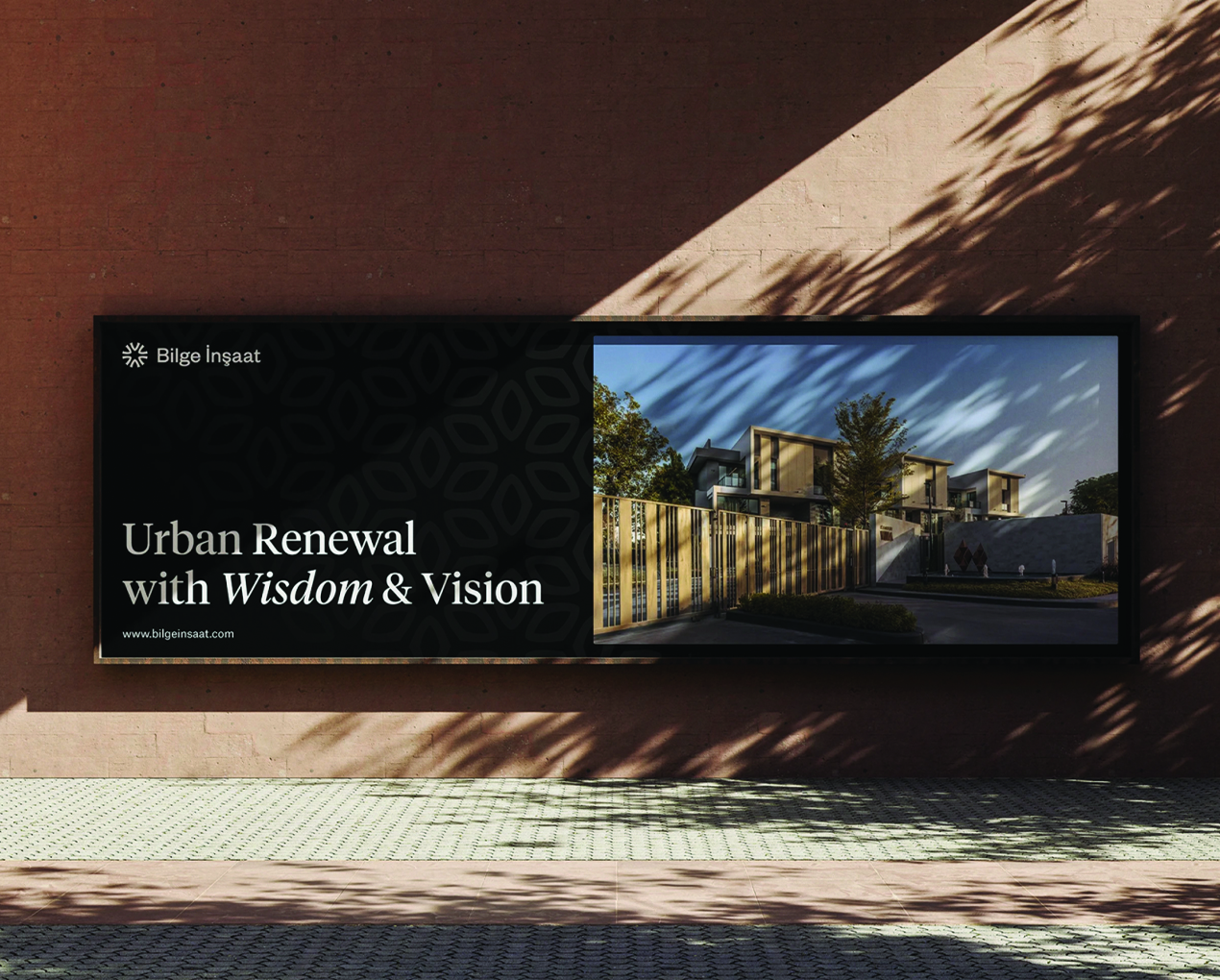
For Bilge Insaat, we in collaboration with WOBL Creative Agency, created a brand identity and logo that reflect the company’s deep roots in construction, reliability, and long-term vision. The identity needed to communicate trust, and architectural precision—core qualities that define Bilge İnşaat’s approach to building spaces that enhance people’s lives.
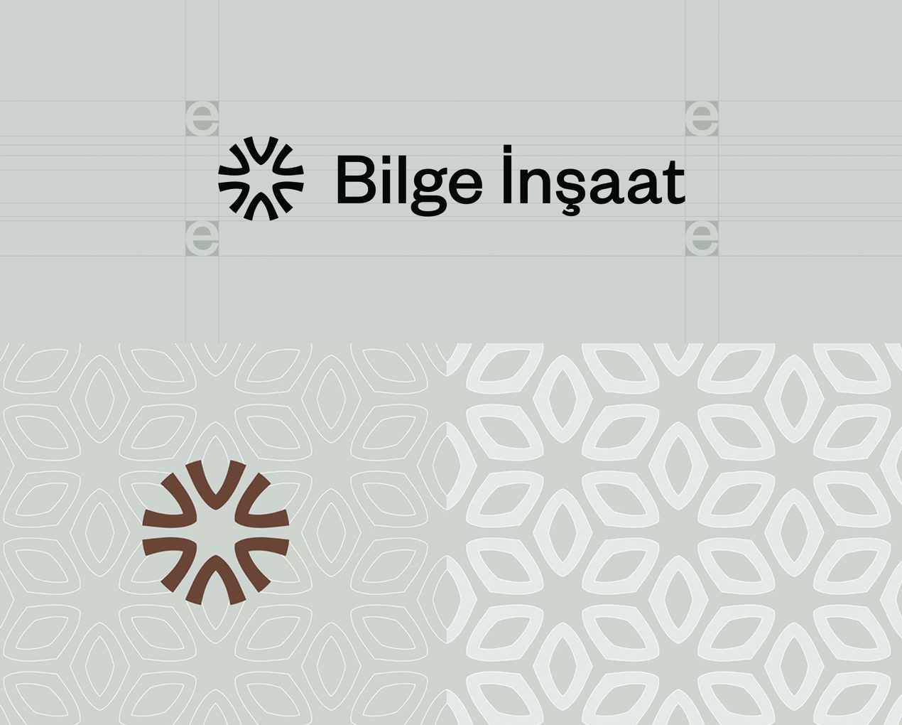
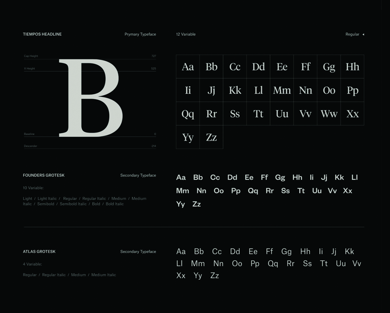
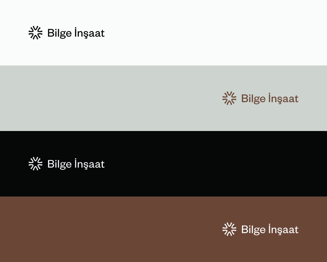
The logo design was crafted around simple yet bold geometric forms that evoke structural stability and growth. The typography complements the symbol with clear, confident letterforms that reinforce professionalism and clarity across digital and print formats. We developed a visual brand system that uses a grounded color palette and materials-inspired textures, giving the identity a tactile sense of construction while maintaining a contemporary feel. This visual language was applied across key touchpoints—website, stationery, signage, and marketing materials—to build a cohesive, recognisable presence that aligns with Bilge İnşaat’s reputation for dependable delivery and meaningful urban transformation.